Showing posts with label Rendering Comparison. Show all posts

Wednesday, October 7, 2015

Case Study: Rendering Comparisons at the JB Martin Gymnasium Renovations

The JB Martin Middle School had a older gymnasium building, that was starting to show its age, and also starting to no longer meet the needs of its occupants, and so the decision was made to renovate the space.

The pragmatic requests were easy enough to provide for, but the qualitative aspects were more difficult to show and predict.  In particular, the users had requested a light, open, lively, larger feeling space, though existing conditions precluded the possibility of actually enlarging many of the spaces.  As a result, our solution was to use finishes, and slight changes to make spaces feel more open and dynamic, as well as adding exterior/interior space to make the building "feel" bigger.  Since this project was done in Revit, we were able to use renderings to better get the feel of the spaces before work was done, to better verify that the proposed interventions would actually work.  See below for some examples of the proposals and their solutions.  Pay particular attention to how the renderings reflect the final product.   Some reflect it almost exactly, while others were adjusted and tweaked during construction.

Exterior of Building, showing the gymnasium seating and storage addition, and the canopy to help add a focal point to the school's courtyard.  The top image is existing conditions, the second is the Pre-construction rendering (note bumped-out portion for additional seating), bottom is the final post-construction photograph.  Other than some colors being off, and the omitted landscaping, the pre-construction rendering looks accurate to the final product, down to the framing of the canopy.
Exterior of building, showing lobby addition
Lobby of building, showing new ceiling and finishes.  The top image was the existing conditions, the second was the pre-construction rendering, raising the ceiling as much as possible to the roof above.  During construction, additional above-ceiling elements were discovered and the ceiling was re-designed to accommodate them, as shown in the 3rd image.   The final image is the completed construction, matching the revised rendering almost exactly.
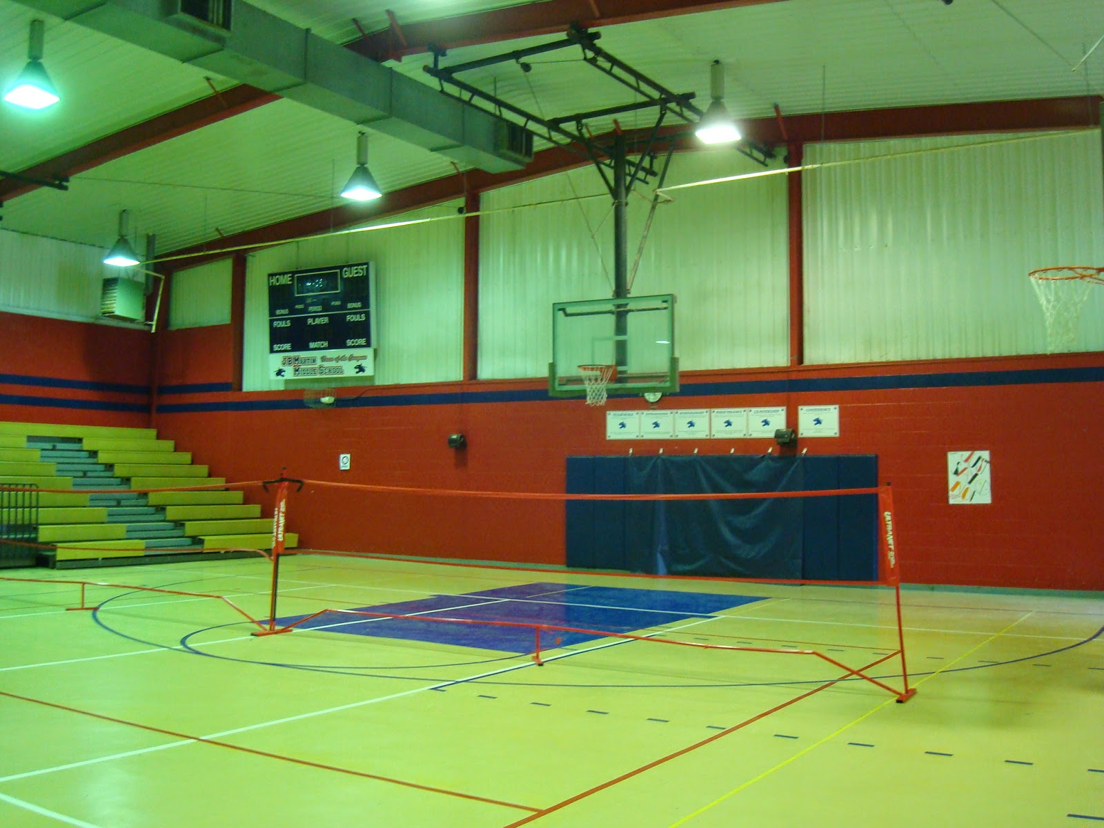
Main Gymnasium, towards addition at end.  The top image is the existing conditions, and the second is the pre-construction rendering, re-painting in lighter colors, reducing the school colors to a stripe.  During construction, the colors were re-tweaked to add school colors at the structure and ducts, as shown & checked in the third image.   The fourth image is the final photograph.  Nearly everything is similar to the rendering, except the light fixtures show up differently, the structural bracing shows up, as well as additional framing for the goal posts.
Girls' locker Room.  The first image shows the existing conditions, particularly the shower-turned storage. Note the high lockers.  There was a specific owner request for the coach to be able to have visual control of the whole locker room from her office. The second image shows the pre-construction design, as seen form the coach's office, with the room painted a bright white, with limited splashes of school colors.  Note how the lower locker banks allow for visual control.  The third shows the final product.   The red elements were eliminated during construction.


Wednesday, April 22, 2015

Case Study: Renderings vs Reality at Casper College School of Music

In the course of designing the new School of Music building at Casper College, in 2011, we created several renderings to aid in our design decisions for the major spaces, to make sure they look & feel right.  These were also used to show the owner what they could expect as a final product, and also distributed to them to use as promotional materials to drum up support.

The program we used (the then-cutting edge Autodesk Revit 2011&2012,) allowed us (and our consultants) to model the entire building in the computer before anything was built, allowing us to more accurately visualize how the finished product will generally look.  There are several schools of thought in terms of renderings, but we generally strive towards accuracy, minimizing the amount of embellishment.   There are, of course, levels of detail that are not always present.  For example, often we don't need to spend time modeling the light switches and exit signs to get a good sense of the space, but in general, with a more accurate rendering, the client is made aware of the final appearance of the space, and if any problems are found early on, they can be addressed before they become expensive change orders during construction.

When the project was completed, HMS hired a photographer to document the same spaces.  See below for the comparison, to show how closely the renderings (created entirely in the computer while the site was a grass field) compared to the real world building, more than a year later.

Concert hall from back rear.  Rendering is on top, final picture below.  This rendering is from relatively early in the process, and there has been some subtle tweaking of the design during the final CD stage and construction, notably in the upper ceiling and wall panels, and the lower railings.
Concert hall from center.  This rendering has been updated, showing the revised railings, wall panels, and ceiling panels, changed during value engineering.

Instrumental Rehearsal hall.  Rendering is on top, final picture below.   Both views are from the back of the room towards the front, but are from opposite corners - the whiteboard is the same.  For reference, the room is more or less symmetrical, except for the window.  The curtain is adjustable, and can be opened or closed to suit the acoustics of the room.
Choir Room.  Rendering on top, final picture below.  Rendering is fairly accurate, other than missing furniture and curtains, and some slight material inaccuracies with the wooden slats at the top, the ceiling tile material, and the wall diffuser material.
Percussion Suite.  Rough rendering on top, final photo on bottom.   Views are from opposite corners of the same room, facing the same windows.  All the acoustic panels and casework is modeled correctly, although the same ceiling and wall diffuser material issues are present, and the carpet tile was laid in a slightly different pattern.  Notably, the curved acoustic hanging panels needed to be shifted slightly during construction.

Front Lobby.  Rendering at top, final image below.  All the elements are in place, minus the owner-supplied furniture.  The color balance differs slightly, with reality feeling brighter and fresher than the warm and dark rendering.
Main Stair.  Rendering at top, final photo below.  Note how the stair, railing, lights, and benches are all built more or less as drawn, except for a few finishes, selected later.
Upstairs Lobby  Rendering is on the top, with final photo on the bottom.  Geometry is essentially identical, along with colors.   There are only a few  special system and owner-supplied elements missing from the renderings, and the room in general "feels" darker than reality.

For reference, this building was modeled in then-cutting edge Autodesk Revit 2011 and 2012, and rendered in the same program, on our local computers.  Since then, we have continually improved our rendering technology and skills to create better and more-accurate renderings.


Wednesday, March 25, 2015

Case Study: Rendering Comparison Mimosa Park Elementary New Kindergarten Wing

The new kindergarten wing at Mimosa Park Elementary was designed, drawn, detailed, and fully modeled in Autodesk Revit, the Building Information Modeling (BIM) program that HMS uses for nearly all projects done since about 2008.  As a result, we had a wealth of information available to us during the design phase, including the ability to create very accurate renderings before anything was remotely built on-site.  As a result, we were able to fix and adjust many potential issues before they became expensive issues on-site.

Due to the proven benefits of our methodology, we intend on learning from and re-using these techniques in the future.  So, here is a short comparison between the original renderings and the final product.  Most are extremely accurate, except for the glossiness of the floor tile and the colors of the doors and cabinets, changed at the owner's request during the submittal phase of construction.   Take a look and see what else is different.

 Typical Classroom towards the exterior.  Rendering is at the top. Beyond the previously mentioned floor tile and casework changes, and the owner-ordered furniture, only a few electrical elements are missing.
The same Typical Classroom, towards the hallway.  Rendering again at top.  Past the previously mentioned elements, the main difference is that the final photographs came out notably brighter.

Cafeteria, towards main hallway.  The cafeteria's design and coloring was actually extensively modified as a result of the renderings, experimenting heavily with different options of adding bright colors to a previously pure white room, to add some visual interest for the kindergartners.
View down main hallway towards west side.  Besides the floor, it is almost exactly right, except from a slight variation in the color of light, due to a owner-requested glass color change during construction.
Music Room, towards the west.  Other than the floor, cabinets, and owner-selected furniture, there isn't much difference.
Art Room, towards the east.  The furniture in the room was later cleaned up and organized.
 Resource Center, towards the south.
 Resource Center Storage, towards the south.   Rendering at top.
Conference room and Workroom, towards south.  The operable partition did not end up needing a floor track, and the selected carpet was different than the renderings, which only affected a few rooms.  Furniture was later added to these rooms.

In general, rendering this project so extensively has helped show the owner the end product long beforehand, so any changes can be addressed in plenty of time, and any misunderstandings are reduced.  We are continually refining our rendering and designing processes, but even at this time (Using Revit 2011 through 2014, and both local and cloud-based renderings) these deliverables show the final spaces fairly accurately.