The JB Martin Middle School had a older gymnasium building, that was starting to show its age, and also starting to no longer meet the needs of its occupants, and so the decision was made to renovate the space.
The pragmatic requests were easy enough to provide for, but the qualitative aspects were more difficult to show and predict. In particular, the users had requested a light, open, lively, larger feeling space, though existing conditions precluded the possibility of actually enlarging many of the spaces. As a result, our solution was to use finishes, and slight changes to make spaces feel more open and dynamic, as well as adding exterior/interior space to make the building "feel" bigger. Since this project was done in Revit, we were able to use renderings to better get the feel of the spaces before work was done, to better verify that the proposed interventions would actually work. See below for some examples of the proposals and their solutions. Pay particular attention to how the renderings reflect the final product. Some reflect it almost exactly, while others were adjusted and tweaked during construction.


Exterior of Building, showing the gymnasium seating and storage addition, and the canopy to help add a focal point to the school's courtyard. The top image is existing conditions, the second is the Pre-construction rendering (note bumped-out portion for additional seating), bottom is the final post-construction photograph. Other than some colors being off, and the omitted landscaping, the pre-construction rendering looks accurate to the final product, down to the framing of the canopy.
Exterior of building, showing lobby addition
Lobby of building, showing new ceiling and finishes. The top image was the existing conditions, the second was the pre-construction rendering, raising the ceiling as much as possible to the roof above. During construction, additional above-ceiling elements were discovered and the ceiling was re-designed to accommodate them, as shown in the 3rd image. The final image is the completed construction, matching the revised rendering almost exactly.
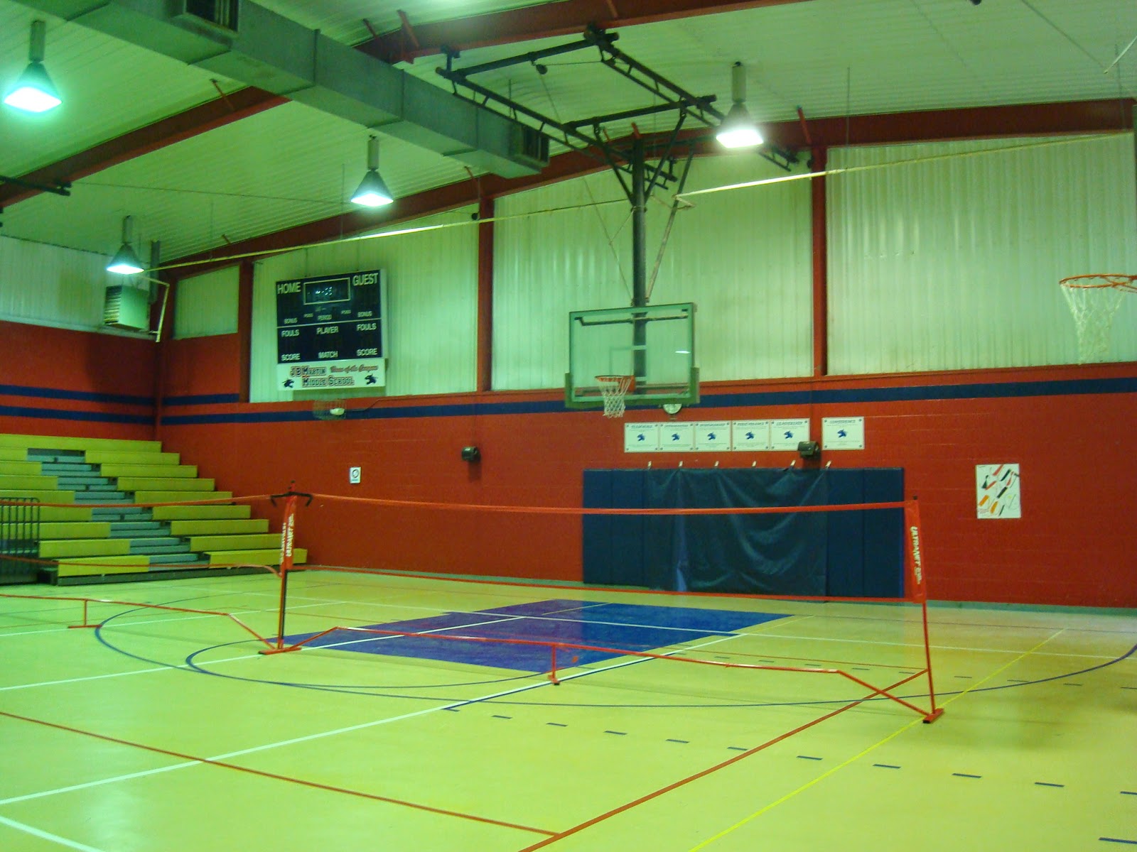


Main Gymnasium, towards addition at end. The top image is the existing conditions, and the second is the pre-construction rendering, re-painting in lighter colors, reducing the school colors to a stripe. During construction, the colors were re-tweaked to add school colors at the structure and ducts, as shown & checked in the third image. The fourth image is the final photograph. Nearly everything is similar to the rendering, except the light fixtures show up differently, the structural bracing shows up, as well as additional framing for the goal posts.


Girls' locker Room. The first image shows the existing conditions, particularly the shower-turned storage. Note the high lockers. There was a specific owner request for the coach to be able to have visual control of the whole locker room from her office. The second image shows the pre-construction design, as seen form the coach's office, with the room painted a bright white, with limited splashes of school colors. Note how the lower locker banks allow for visual control. The third shows the final product. The red elements were eliminated during construction.


